In this week the stock market closed lower. Normally this is not a situation to write a blog post, because the markets move all the time. But we are in a strong bull market and everyone tries to shout for the top. The last one who shouts for a top is right, but as traders we must think independently and make our own analysis.
How can we analyze the markets without a too big influence of our emotions? We look at price charts.
Price charts telling us everything we must know:
- The direction (up, down, sideways).
- The strength of a move (volume).
- The highest odds for the next move (continuation of the current trend).
OK, let’s look at the markets from a higher time-frame. The higher time-frame tunes out the noise of daily fluctuations. This makes it easier to see what’s really going on.
S&P 500 – Strong bull market with pauses
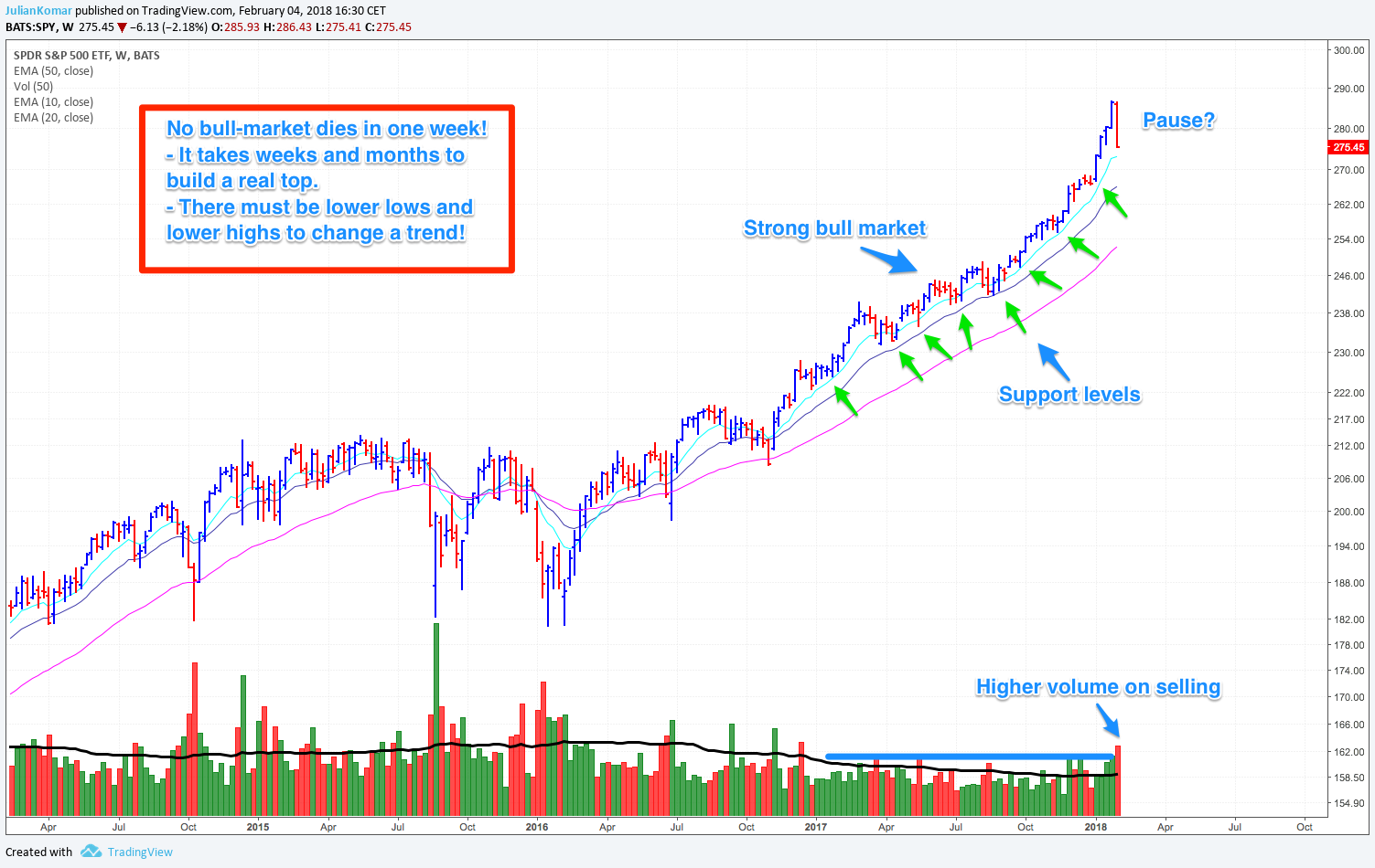
There is a clear bull market in S&P 500 stocks. The price is moving up and the last weeks the move accelerated.
This week the down move wiped out two weeks of strong gains. In addition the volume was higher, but not excessive.
Is it a top now? We don’t know. But the odds that the trend will continue are higher. Maybe there will be a pause for some weeks or months. If the price prints a new all-time high it is a clear sign that the trend continues. Until that it is likely that the market will take a pause.
The bearish scenario is far away. Of course the market can crash, but it’s not very likely. If you look back in the charts, you will see that a real market top needs weeks and months to build.
Nasdaq – Smooth up-trend with consolidations

The Nasdaq shows the same picture: Strong up-trend with acceleration. Now the price moved down for a week and maybe started a new consolidation.
You can see a similar pattern in April to June last year. There was a strong down week and a bull flag pattern. After the price reached the weekly 20 EMA (~100 daily EMA), the trend continued.
The only thing what catches my attention is the volume. It’s very strong during down-moves. But the strong volume is not accompanied by price movement. Maybe there are other reasons for that. In addition it’s a sign that the high volume is absorbed by the market participants.
If you look at the chart, does it looks like a top? No! It’s currently far away from that.
Russell 2000 – The weakest index
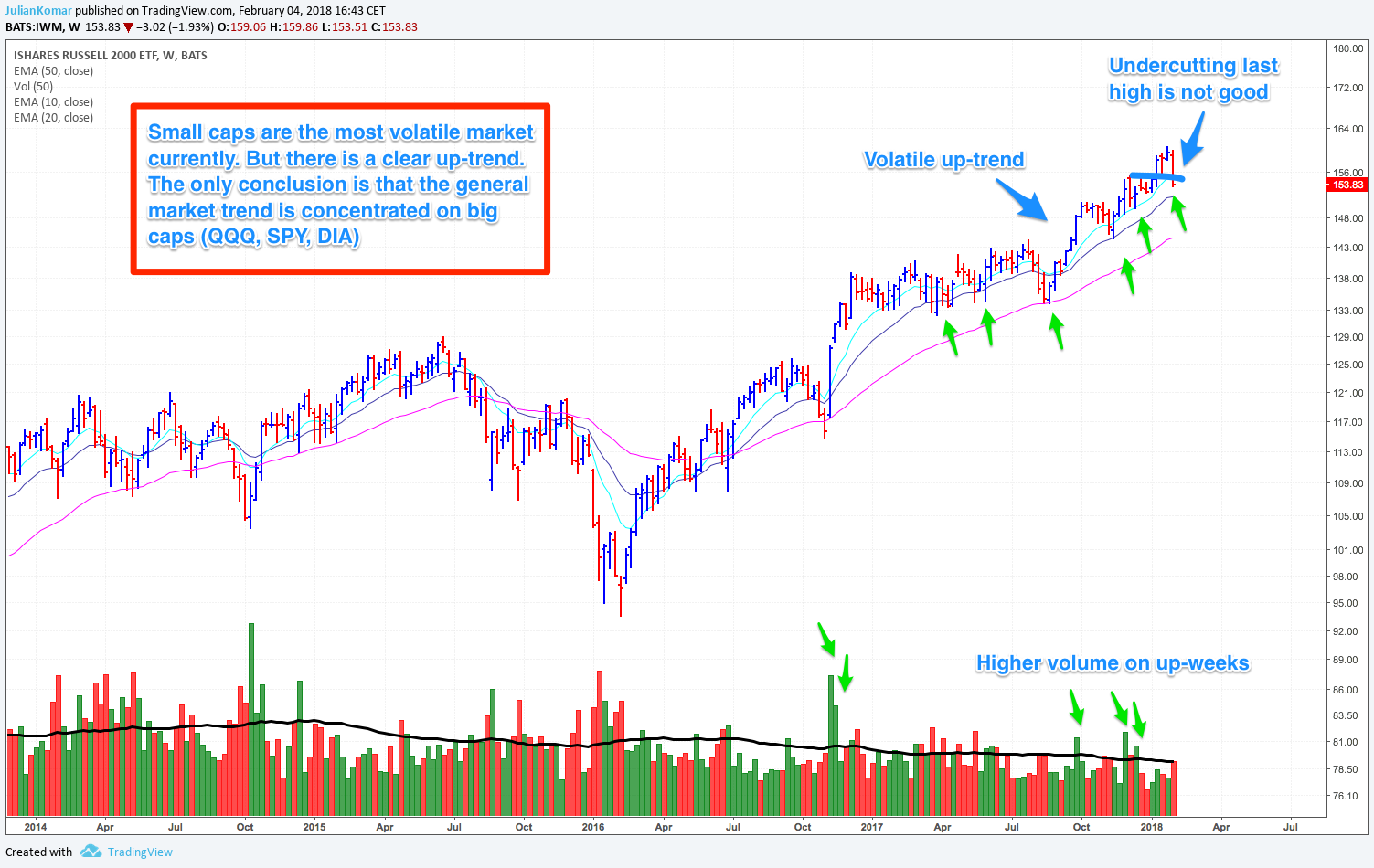 I mostly trade small and mid cap stocks. That’s why I pay a lot of attention to the Russell 2000 index. You can see in the chart that this index is much more volatile than the big cap indices. That makes it more difficult to trade.
But the overall picture is clear bullish. There are higher lows and higher highs. And that is by definition an up-trend.
As long as the Russell 2000 trades above the last big consolidation phase in August 2016 to July 2017, everything is ok. If the price moves below $143 ($IWM) it will be a first warning sign. But we are far away from that.
The violation of the last high this week is not a good sign. But it’s still not a trend reversal. It just say that the volatility will continue.
You can see that a look in the weekly chart gives you a much clearer picture. If you look into the daily charts instead, you will see much more volatility. The bigger picture can give you more confidence and objectivity.
T-BOND – A new trend arrived in bonds and interest rates
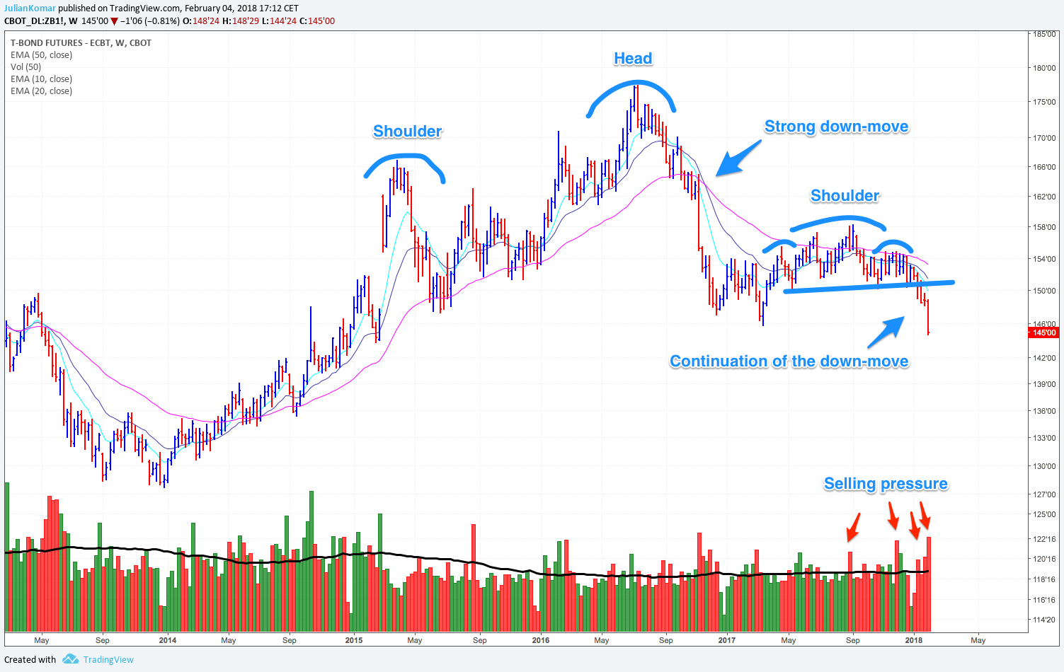 For me the bonds are currently a very interesting market. Why? They starting a new down-trend. If you look at the 2 year, 5 year or 10 year note, you will see that they move much faster as the 30 year T-Bond.
Yes, maybe the new trend has to do with the FED politics. But the reason is not important. As Paul Tudor Jones famously said: “… It’s your job as a trader to buy what’s going up and to sell what’s going down …”.
The chart tells you everything you must know:
- Head and should pattern is a sign for a trend change.
- There is already a down-trend in place.
- All moving averages are aligned in a bearish fashion.
- The volume increases with the price down-move.
- The last lows are taken out and the trend continues.
There are several possibilities to profit from that new trend. For example you can buy an inverse ETF or trade the future directly.
Gold – Waiting for a decision
 The last weeks showed a strong up-move in gold. But if you look at the weekly chart, you can see quickly that’s just a move in a consolidation.
If you want to make big profits you need the upper timeframes behind you. If the upper timeframe is in a consolidation, the lower timeframes mostly are volatile.
You don’t want to trade a market in a consolidation. There can be quick reversals and high volatility. You only want to trade markets in a clear trend which is supported by institutions (smart money). Why? They move the markets and start/support huge trends. If they are not interested in a specific market, you can se it by low volume. As soon as they rush into the market, the volume will pick up and the price moves stronger.
Back to gold. They will be a decision: Breakout or breakdown. Do not anticipate! Wait instead until the chart and volume speaks.
Crude oil – Energy markets in a bull run
 The last weeks Crude oil showed a nice up-move. Before the up-move started there was a one year sideway bottom consolidation. You can see the head and shoulders formation which is a sign for a trend reversal.
But if you look at the monthly chart, everything looks different. The current up-move is just a small fluctuation in a down-trend. There can be sharp reversals and set backs. But the opposite it also true. There can be up-trends which lasts weeks and you can profit from them.
I like that the last up-move showed low volatility. It’s a good sign and the market participants show no doubts. We will see how long the up-move will go on.
US-Dollar – New down-move started
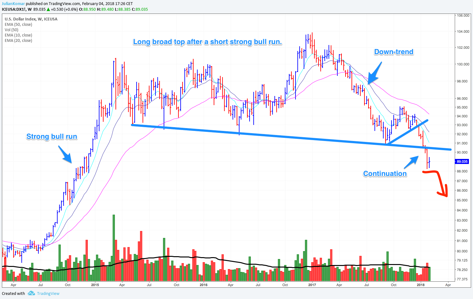 The US-Dollar future is mostly the same as the forex pair USD/EUR (or EUR/USD). And yes, there are correlations to Crude oil and gold. But it’s a very interesting market at the moment.
I always try to get into new trends. New trends shows mostly a stronger move because everyone tries to get in and that gives the trend new fuel.
US-Dollar is breaking down from a long top. You can see the first down leg in the chart picture. Now the second leg has started. The odds are high that the down trend will stay for some time.
There are several instruments to profit from this trend: Futures, options, ETFs, forex or the money market itself.
Recommended books
Here is a small list of recommended trading books about this topic.
[amazon box=”0735200661,0735201447,007147871X”]


 chart analysis – China eCommerce stock")