
One thing I learned the last time was to manage my own equity curve. This helped me to make a huge progress as a trader. I want to share this with you.
I got the idea from my two mentors I am actively following or where I attend their programs: Trader Steve from UK. He taught me to track the closed equity and interpret it. Olivier Tischendorf who wrote a very good article about that. In addition he called my attention about what type of equity curve I wish to have.
What is an equity curve?
If you look at a stock chart you see the up and downs of the price. One share is one piece of the equity of a company. So you say that you are monitoring the equity curve of a company if you look at a chart.
The same is true if you look at the price chart of a mutual fund or ETF. In that case you look at the up and downs of a portfolio of stocks.
Now look at your trading. If you trade a portfolio of single stocks, you have the same situation as a mutual fund or ETF. You have multiple positions and with that you can create an overall equity curve. It’s the same as in the scenarios above.
So your own equity curve is the picture of all price movements in your portfolio. It shows the total value of your portfolio.
How to build an own equity curve
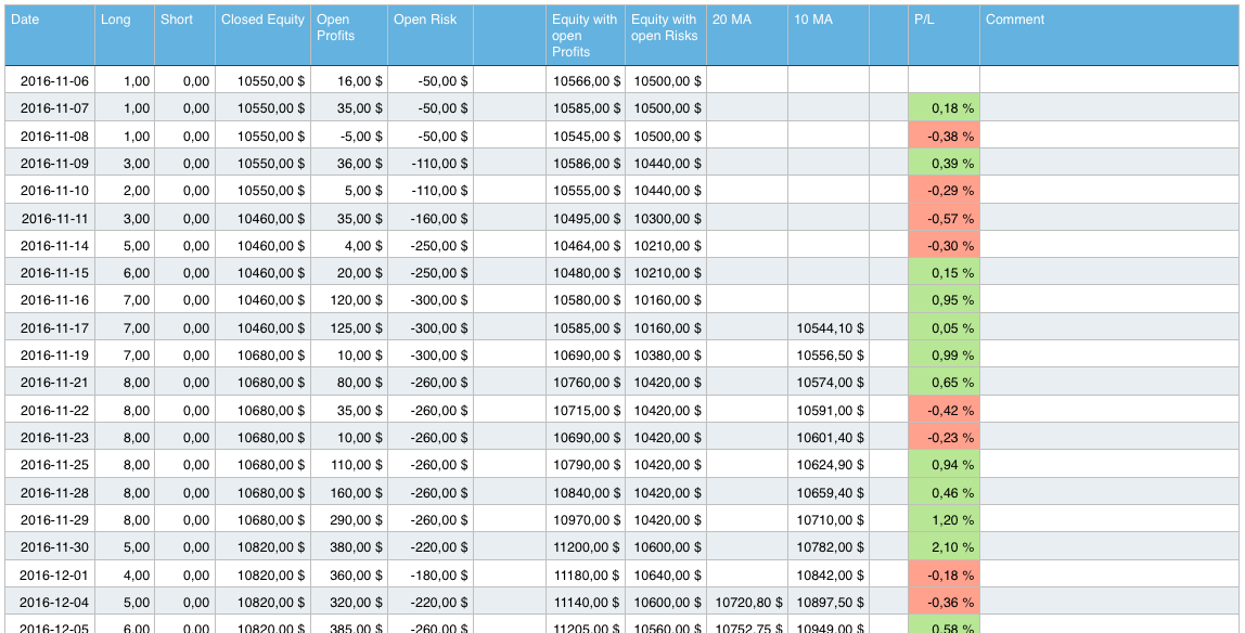
To create your own equity curve you can use a spreadsheet (f.e. Excel). Everyday you write down the following values:
- Closed equity: The value of your trading account without open profits/losses. This is the amount of money you have in your account. It shows the development of your closed trades. Everytime you close a trade, this value will go up or down.
- Open profits/losses: This is the sum of all open profits or losses in your trading account.
- Open risk: Here you summed up all risks of all single positions. This shows you the amount of money you can loose if all positions will be stopped out.
I also recommend to gather the number of long/short positions. With that you can track the number of open positions and evaluate how often you change your portfolio.
Now you can build some sums. These sums will create different curves on a graph:
- Closed equity with open profits/losses: This number is your current equity curve. It shows you the worth of all positions if close them immediately.
- Closed equity curve with open risk: Here you can see the “worst case scenario”. You can see what will happened if all positions will be stopped out in one moment.
- Percentage change: That number shows the change of your portfolio in percentage. F.e. +1% or -1%.
Creating the graphs
Now you can take your spreadsheet and create a graph. I recommend to track two different graphs:
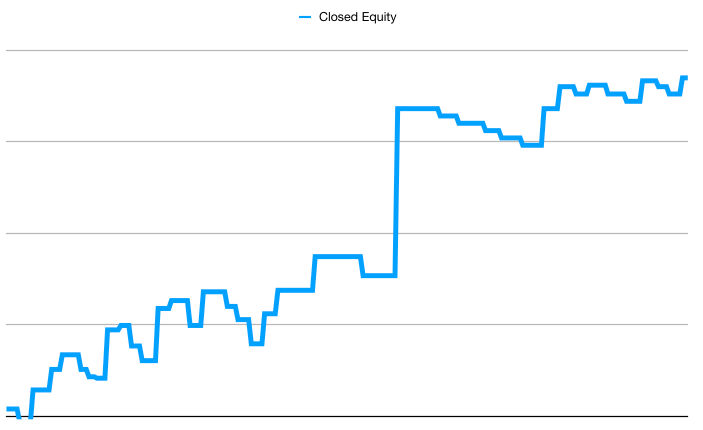
- Development of your closed equity: This shows you the development of your closed equity without any profits or losses. This gives you a much more clear picture without the daily fluctuations of your portfolio positions. It is the most important graph. If this graph is falling, you are in a clear draw-down.
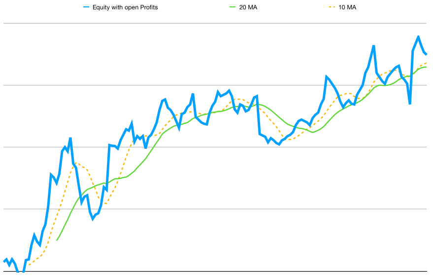
- Development of your closed equity with open profits/losses: In this graph you included the profits and losses of your portfolio. You can follow how your portfolio value is changing over time and you can see the impact of daily fluctuations of your trading positions. It helps you to see if you are too aggressive or too conservative. You can compare it to the market indices.
In addition I would recommend to add simple moving averages to the graphs:
- 10 day moving average: This is the fast moving average. In good time your equity curve should be above that.
- 20 day moving average: This is a slower one. It should rise the most of the time.
Depending on your trading time frame you can choose different lengths of the moving averages, f.e. 20 and 50 or 50 and 100.
Interpreting your equity curve
If you created the table with all the necessary values and graphs, you can start to follow your equity curve. After some time you get a feeling how your trading is mirrored in the graphs.
All your decisions will be displayed in the graphs, f.e.:
- If your timing is correct and your trading produces profits or losses.
- If you should be more aggressive because your equity curve is rising.
- If it’s time to be more conservative or sell positions because your equity curve is falling.
- If you are positioned to heavily in one sector because your equity curve is dropping heavily if one specific sector is falling.
- If one of your trading positions has a big impact.
- If it’s time to go to cash because the moving averages are crossing.
I would recommend to follow your equity curve for some moths. After that you get a good feeling how you trade and what are possible rules to manage your risk and equity curve.
Creating a rule set with your equity curve
I made the experience that you can create a rule set for your equity curve. This helps you to manage the volatility and risk better. It’s always my goal to reduce the fluctuations to the down side.
After tracking my equity curve for some month I create some rules which I tested. These are just examples and you have to create your own rules.
- Equity curve drops below moving average 20: This is a first danger sign! Something is wrong in your portfolio if this happens. Mostly the dropping will continue and a draw down starts. If this happened I immediately check all my positions. Often I start to sell the loosing positions and maybe reduce winner. I start to build up cash.
Often I made the experience that a single position is too big. If this is the case, I reduce it so it has a lower impact on the equity curve. - Equity curve climb above moving average 20: Now it’s time to be more aggressive and open new positions. It could be that your equity curve will drop below the average 20 for one or two days. If it recovers immediately this is a good sign.
- Moving average 10 crosses below moving average 20: This is a clear sign that something is wrong. In that case you should consider to go to cash. After being in cash you should make very small commitments and wait until your equity curve is rising again.
- Moving average 10 crosses above moving average 20: Good signal! You are on track again. It’s time to be more aggressive.
I do not found the optimal rule set for me, but I am always experimenting and learning. But I found this is a great method to manage risk actively.
Additional observations
Besides the rule set you can observe some more thins in your equity curve. Over time you create new rules to manage that. Here are some observations I made:
- The biggest down-swings comes after the biggest up-swings. I observed that my equity curve will dop immediately if it climbs steep before. F.e.: If I have a big up day (2-4% in one day) it will go down the next days. It could be a sign that it’s time to take some profits.
- There are chart patterns in your equity curve: I found double bottoms, head and should, trend lines, horizontal resistance, false break-outs etc.
- Always try to reduce the down side. It’s very dangerous to let losses run in your equity curve. The better you manage the down side the easier it is to reach new highs. Start to manage your risk and exposure actively. F.e.: It your equity curves creates a new lower low, start to reduce your exposure.
- Take crossings of the moving averages seriously. In the beginning I just follow my equity curve. I didn’t had any rules. But I quickly observed that there are clear visible trends in my equity curve. If it starts to dop and the moving averages are crossing, it will to continue. Only reducing your position size will help.
- Losses will bring new losses – profits will bring new profits. It’s the same as with number 4. If your equity curve starts to drop, it will continue to drop. F.e: If you have a down day of 1,5% or more, the next days will be loosing days, too. You must define a maximum for you. What will happen if you equity curve drops 3% in a day? Or 4% over 5 days? You should react to it.
Recommended books
Here is a small list of recommended trading books about this topic.
Last update: 2022-05-20 / affiliate links / Images: Amazon Product Advertising API


